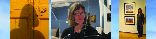
Rebecca Livermore / Artist Statement
Using vivid watercolor pigments and the fluidity of my medium, I design paintings to emphasize the form and beauty of my subjects – and to please the eye.
My parents were creative people and my forebears include artists, architects and designers. While I entertained childhood dreams of being an artist, my twenty-something self discovered graphic design, a field in which I earned a master’s degree and subsequently enjoyed an interesting and rewarding 20-year career. Later, my forty-something self yearned to re-connect with fine art and specifically, to paint landscapes. As I transitioned from designer to artist, I found my design training informing the way I design my compositions – altering reality as I please to create both balance and eye-catching delight. Sometimes I simplify forms to highlight organic, flowing contours or to call attention to a certain aspect of my subject. At other times, I add complexity with the use of stylized lines or shapes to define edges and emphasize the essential characteristics of my subjects.
My paintings portray the variety of places I’m drawn to, from the wide-open spaces of the American West to interesting forms found in built environments around the world. I respond to local color but also use vivid color to more boldly evoke the feeling of my subject. I work with the transparency of watercolor and the tendency of it’s pigments to blend together in lively ways to add richness and appeal to the eye. Most of my paintings begin with an underpainting of wet, loose, and/or splattered paint which provides the finished painting with both interest and unity.
I particularly love to paint skies. When I begin to paint a sky, I load several brushes with an array of colors, allowing me to add quick touches of various colors while the entire sky is wet. I enjoy using lots of color and have found that the restrained use of almost any hue for almost any subject, detail or highlight can be effective in delighting the eye and in unifying a painting.
My still-lifes are always painted from actual objects and some of my landscapes are painted “plein air,” but most of my landscape paintings are based on my own photographs, often supplemented with multiple exposures, field notes and sketches. I’m always looking – observing local color, light and shadow, line, value, texture and composition. I’m thinking about my next painting or something new to try. When traveling, I pull over to the side of the road or make detours to photograph a particularly appealing landscape or the light falling on the land in a remarkable way. On hikes with family and friends, I’m usually found lagging a little behind – camera in hand, looking and seeing and photographing future paintings all around me.
Through careful research, I have selected a palette of lightfast pigments which will not fade over time. In addition, all my paintings employ acid-free paper and archival framing materials.
A few of the many artists whose work I have admired and studied, possibly influencing my paintings, include Mark Adams, Gustave Baumann, Charles Demuth, Maynard Dixon, Paul Klee, Georgia O‘Keefe and Gunnar Widforss.


